
I think I’d be pretty happy working in some old magazine advertising agency. I love the intersection between art, design and psychology. You can so clearly pick apart how every detail is intentional- a serif font to convey tradition, ample negative space to express importance, stereotypes and cliches to define the target audience.

I study these posters often in my own work. I think primarily because they’re so simple. There’s a thousand things going on in a Baroque painting, each carrying different reasons for being there. On a pre-2000s Apple advertisement there’s not. You can place it in a historical context pretty quickly, and understand the goals Apple was aiming to accomplish. It’s a language I enjoy de-coding.

A lot of these work because they use the female body to sell. Like American Apparel, for example. I honestly don’t think the brand would have held the popularity it did without their sexually charged ads. As I look through their archives, it’s incredible how far they took it. It works. It’s shocking to the viewer but also appealing. It feels dangerous yet perfectly in line with societal wants. At its core, there’s nothing necessarily new- sex sells, but now with the style of flash photography and bedsheets, making it feel all the more intimate and yours. It's incredible how obvious it is.


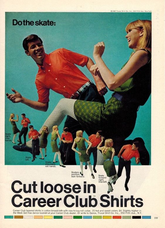
Or how they're all so clearly arranged with type. There's no warping of text or heavily abstract layout. It's all straight, easy to read, and marketable. Recently I've been trying to grasp the basics of graphic design by imagining I'm designing on a letterpress like these.

My favorite brands from this era are Apple's and Nintendo's. Like I said before, Apple was great at playing psychology. This image, for example. Maximizing how simple a computer is to a public that's still new to them. Short phrases & a picture of baby food to further humanize the tech. Maybe it'll make a mother see herself in it. Etc.


Overall takeaways from this:
- Font choice matters so much. The majorty of these are just photography and a font. It's saved me the pain of searching through Adobe's thousands of fonts by just screengrabbing the most commonly used from these.
- You can make stuff as simple or as complex as you want. Look back at the American Apparel ads, or the Velvet Underground poster below.
- And of course, keep it fresh.
That's all from me right now. Enjoy the rest of these images I've gathered. see ya